Graph controls
Right-click the chart for the context menu, or open View > Graph on the main menu bar for the same set of controls. Most settings are per-tab and are remembered between sessions. To set the values that every newly opened chart starts with, see graph options in Preferences.
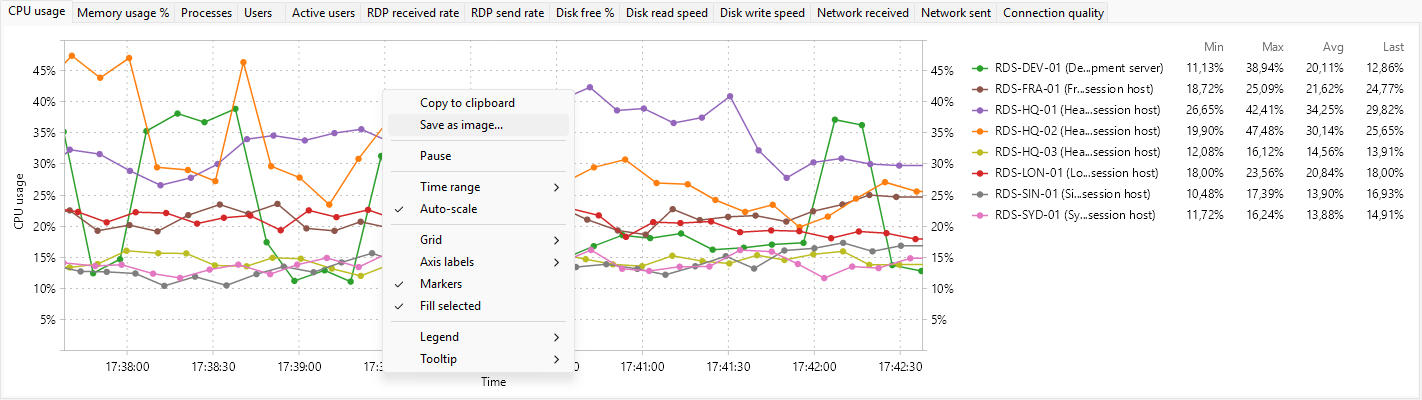
Pause
Pause freezes the chart in place; new samples stop arriving until you turn pause off. The data is still being collected behind the scenes, so when you resume the chart will jump forward to the current time. Use pause to study a recent spike without it scrolling out of view.
Time range
Time range opens a submenu of presets: 1, 2, 5 (default), 10, 15, 30, 45, and 60 minutes. The chosen value is the visible width of the time axis.
A longer time range needs more buffered samples and uses more memory; the program keeps history for at least the maximum selected time range.
Auto-scale
Auto-scale lets the value axis adjust to whatever the data covers, with a margin above the maximum. Turning auto-scale off freezes the axis at its current min and max so a brief spike does not rescale everything. Toggle this when you want to compare the size of changes rather than the exact values.
Grid
The Grid submenu toggles the grid lines:
- Vertical lines - vertical grid lines at time-axis ticks.
- Horizontal lines - horizontal grid lines at value-axis ticks.
Defaults: both on.
Axis labels
The Axis labels submenu toggles the axis names:
- X axis - "Time" beneath the time axis.
- Y axis - the unit (for example, "%", "MB", "B/s") next to the value axis.
Defaults: both on.
Series markers and fill
- Markers - draw a small dot at every sample. Helpful when the series has few points or when you want to read individual values.
- Fill selected - fill the area between the line and the value-axis baseline with a light tint of the series color. Helpful for showing magnitudes when several series overlap.
Both default to on.
Legend
The Legend submenu controls what the per-series label shows:
- Position - submenu with None, Right (default), Left, Top, Bottom.
- Current - the most recent value.
- Minimum - the minimum over the visible time range.
- Maximum - the maximum.
- Average - the arithmetic mean.
Tick combinations to taste; turning Minimum, Maximum, and Average all on gives a compact statistical summary alongside the live value.
Tooltip mode
Tooltip lets you pick what hovering the chart shows:
- None - no tooltip.
- All series - one tooltip line per series, at the time the cursor is over (default).
- Nearest point - just the value of the series the cursor is closest to.
The tooltip is anchored to the mouse position; the time it reports is the time at the cursor.