Graphs overview
The graph panel lives below the data tree on every monitoring tab. Each tab has its own independent set of charts.
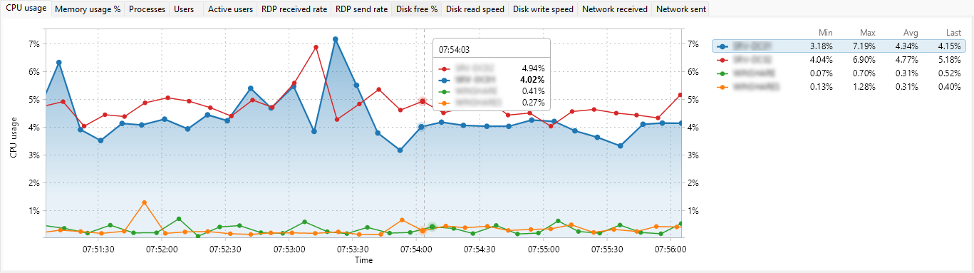
What it plots
One series per row in the tree above. A row contributes a series when its checkbox is ticked; clearing the checkbox removes the series from the chart. The currently selected row is highlighted with a thicker line.
Tabs of metrics
Across the top of the panel is a tab strip with one tab per metric you have enabled (for example, CPU usage, Memory usage %, Network received); see choosing which metrics to graph to control which ones appear. Click a tab to switch the chart. The metrics shown match the chosen entity type:
- Servers tab - 26 server-level metrics (see Server metric graphs reference).
- User sessions tab - 21 per-session metrics (see User session metric graphs reference).
- Processes tab - 6 per-process metrics (see Process metric graphs reference).
Time axis
The horizontal axis is time. New samples appear on the right and slide left as time passes. The default time window is 5 minutes; you can shorten or lengthen it from the graph context menu (see Graph controls).
Value axis
The vertical axis is the value, scaled to the metric: percentages 0-100, bytes per second auto-formatted (B/s, KB/s, MB/s, GB/s), megabytes for memory, count for things like processes and handles. Auto-scale is off by default, so the axis keeps a fixed range scaled to the metric; turn it on to let the axis adjust to the data.
Showing or hiding the panel
Drag the splitter between the tree and the panel to resize either side. The split position is remembered between sessions.